Practical Skills
This is my Practical Skills Page
This page will include all the practical parts of the project like Level Design, Modelling, Learning New Software, Colouring, Texturing and Unreal Engine 4
Creating a Blockout
In the questions section of my idea pitch Fraser talked about how helpful it would be to make a Blockout of my level. This would be useful because I can get the general layout made quickly. This will help tons when it comes to adding proper models because I will know where they all have to go.
This is a short walk though of my block out environment, it has a very basic layout with cube buildings.
Learning Substance Painter
I've never used Substance Painter before so I decided to have a look at it seeing how if I can start to use it for my models, it will add some nice textures.
To learn the software I followed a bit of a beginners tutorial from FlippedNormals
This was very helpful because the people explained all the basics very well, I learnt what lots of the UI does and some of the essential keybinds.

This is what I saw when I loaded up SP, I used a preset model to practice texturing.
You have some materials on the left next to the viewport, then a 2D
UV unwrap of the model. All the way to the right are the settings, hierarchy and material settings.

I then looked into the materials and drew this simple face using a gold texture.

Following the tutorial I looked at using the Fill tool instead of the Paint one, this is useful because you can colour/texture an entire model easily. You can change lots of different options like Colour, Metal, and Roughness.
I also learnt about Grunge's, these are textures with lots of detail, lots of them were quite messy like the one I used here called Grunge Concrete.

Below are some other examples of Grunge textures.


I also learnt about different types of projection, by default this is set to UV Projection, this works alright but when you take a closer look you can see the edges of the texture.

This is a example from the tutorial, you can clearly see the edge of the image texture.
Luckily you can fix this by changing the projection to Tri-planer projection.
This is a very useful detail to know that will make my textures look cleaner.

After learning the very basics I decided to try and texture the preset model, I used the grunge textures but made sure to change the colours and metal settings.
It's nothing special but it was helpful because now that I know the basics I can start to texture more complex models.
Next I want to texture one of my one models, I feel like a pipe will be a good starting point because they are easy to model and would look quite good with a dirty metal texture.
I am going to create some steampunk pipes then add textures using substance. So I did some research and made a moodboard for some Steampunk pipes.

What I gathered from my research is when you take away all the valves and extra details, and just look at the pipes themselves they are really really simple, if they didn't have textures they wouldn't look that impressive whatsoever.
I've made pipes before by using cylinders but I knew there was a better way so I went onto YouTube to find a more efficient way. I stumbled across a guy called Ian Hubert, Ian is what you'd call a blender film maker I guess, he creates little short films using Blender. He also has a series of "Lazy tutorials" which are usually 1 minute long tutorials of pretty much anything. In my case I found one where he talks about pipes. He uses curves then extrudes them instead of meshes. I decided to follow his tutorial to learn another method.
Below are some of his tutorials, including the one I followed and another one I found really interesting.

Here I made a curve and edited it into a rough pipe shape, then I increased the bevel depth in the curve settings to make it into a proper pipe.


After learning the basics I made some more pipers that are more complex, I then converted them to a mesh and extruded out some of the faces to give it more detail.

Then I put my model into Substance Painter, I followed this video as a guide on how to do it, once it was in SP I textured it using the skills I learnt previously like Grunge textures with the Fill tool.
I would say the end result came out better than expected.

Making a Cel Shader
After my experiments with Substance and trying to make textures I decided to go more towards Cel-Shading, this would speed up my work a lot because I would only have to add colours instead of detailed textures.
I looked up some tutorials on how to make a Cel Shaded art style.

Here are some screenshots of the Cel Shading and the blueprints I made it with.


I am very surprised with how good this shader looks because it was surprisingly easy to make. However I do need to fix one problem with the shader, any light source that is added to the scene automatically becomes white, I can fix this by following more of the original cel shading video.
Early Prototypes
I made a early prototype of a pipe to experiment with detail, its a very simple design that could be used to run along a floor or something.

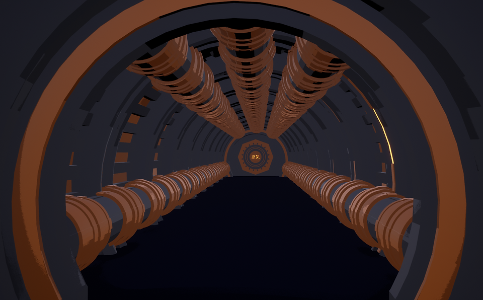
Next I worked on a entrance prototype, I wanted to do a kind of tunnel design that the player would walk through, this would be a good opportunity to have lots of steampunk architecture like moving gears and pipes. It's a lot more interesting than a simple cave entrance.


I really like this concept, I want to add to it and try different designs.

I asked my mate Devon what he thought about this pipe design and he said that it was too detailed, he said that I should space out the detail more.
I wanted to try a different design with the pipes so I copied the building over and started again.

This time I kept the feedback I had got in mind, I went for a sleeker look with lots of detail, just not so much cluttered around. I like the design its very different to what I made before, I like the variation, having different types of pipes around the environment will keep it interesting, different pipes for different purposes.

I went with a different layout for the pipes, adding more at the top and some down the sides, I felt like this made it feel more busy and industrial.
As I've been modelling I've been trying to add more detail to everything, for example these pipes on the floor have little support legs.

At first I thought that modelling tiny little details like this would be a waste of time because most players would run straight past it but for the people that don't, the people that take their time and look around for the little details. It's better for them to be there than a empty space. Having the mindset of trying to make each part of my models as detailed as I can is going to really going to improve the quality of my modelling skills.

Out the front I added some pillars along the walls and a Torii gate, Torii gates are structures found in Japan that are commonly used to mark the entrance of a shrine. Although my mine is far from a shrine I like the idea that maybe in my steampunk world people see places like mines as spiritually important, providing the steam and minerals they need to thrive.
Next I added more to the top, I wanted to make a building on top that people would look out from, I tried making Asian style rooves before but wasn't that successful so I did some research to try and find a better way.
I came across this video that really helped, mainly with the roof tiles, he uses the bisect tool in a way I haven't before. Following a bit of this video really helped me to create the roof you see below.

After creating the roof tiles I made a roof and copy pasted it to create multiple layers.

I really like how this turned out, I didn't expect it to look that good just using the same roof asset but it came out nicely.
I also added some windows and pillars to hold up the roof.
After adding detail to the top I added some to the sides, I went with the same pillar design but realized that I needed something on top of them otherwise it all looked the same.
At first I tried this spike design that looked alright, I feel like it would suit a castle more than a mine entrance though.

My next idea was to not have anything tall on the top and just have little details on the sides, I went with gears to make it feel more industrial/steampunk.

I like this design a lot more than the last, I like the little details on it, I feel like the pillars will really pop when I add colour.

I added some other detail to the building, like the detail on the sides of the building and the chimney.
Lastly I added a door inside that will give you access to the mine, I made a little logo to go on it too.

The symbols mean Steam in Japanese
Colouring The Entrance

At first I wanted to stick with the red black and white colour scheme of Japanese buildings, I thought it would contrast well with the greys and golds of the steampunk sections of the build.
But after experimenting with it a lot I realized that there were just too many colours and it was not working well at all.
Below is a colour palatte I made from the image next to it, I did this so I can get a clear idea of what colours I could use.


Instead I took out the red and used the grey and gold from the steampunk parts to colour the entire model.
I feel like it works a lot better with the small colour scheme.
I stuck with the same design but made it not as tall, I feel like this matches the building a lot more.

Looking back at this I liked the colours more, but I realized I needed to change the chimney, its too tall for the building.

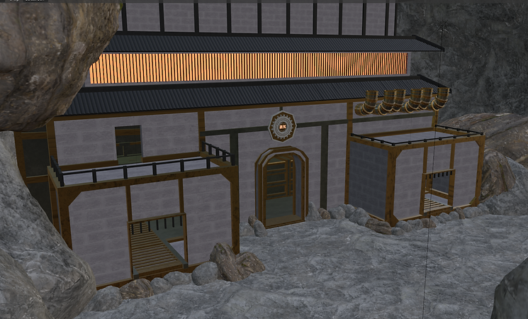
This is a render of my mine entrance, I added some other details like the logo on the front of the peak and bars on the windows. I also added lights to the tunnel because it was very very dark.

I am very happy with how this turned out, its a lot more detailed than any of my previous models, I am very excited to see what it will look like with cel-shading.

This is my entrance in UE4, with cel-shading applied, I am very happy with how how it turned out, the only problem was that metallic materials don't work that well with cel shading, or not the shader I made at least.
I made the gold colour a little metallic but it is still quite matte, I feel like it still works well because the cel shading effect works quite well against the colours.
I do have a problem with smoke however, I have a chimney on my building so naturally I wanted to have smoke coming out of it, but because the sky is stuck in a bright white because of my cel shader, it doesn't show up that well. I need to do more research to solve this issue, because the sky in the cel-shader tutorial wasn't bright white.

I do have a problem with smoke however, I have a chimney on my building so naturally I wanted to have smoke coming out of it, but because the sky is stuck in a bright white because of my cel shader, it doesn't show up that well. I need to do more research to solve this issue, because the sky in the cel-shader tutorial wasn't bright white.
Lighting Problems
So I have a emissive material in the tunnel of my entrance, this was to create lighting but I found out that you can't actually have emissive materials emit light. So I compromised by adding spotlights, this worked quite well with the spotlights bouncing around the tunnel to create a nice effect.

Before
Sadly when I tried to build the lighting everything messed up. all the spotlights stopped making much light at all. Also the building became black, this was easily fixed with a directional light however.

After
I tried different ways of building the lighting, for example before I was always building the lighting on the preview quality, this time I set it to high hoping it would keep the lights.

Before

After
After changing the build quality and it still not working I talked with Frazer and he sent over a video that might help.
This video mentions how you can fix dark shadows by changing the world colour, in my case changing it from black to a light grey might solve the issues.

After all of these problems I believe that sticking with Cel-Shading is not a good idea, even if I solve all of the issues I currently have, because of my limited knowledge with UE4 and my even more limited knowledge of cel shaders and how they work I will probably run into lots more issues.
Seeing how we are almost half way through the project and the deadline is already quite close I'm going to ditch cel shading and go for a texture art style,
Switching Art Styles
Before modelling anything new I wanted to texture my mine entrance, I used Textures.com
to get images textures. I then started experimenting with different materials.
I used lots of different materials, like stone bricks, rough steel and bare bronze. I applied the materials in blender making sure to UV unwrap them first so the textures look good.
I used a rough steel material for most of the metal parts, I wanted to use the same texture for the roof because it looked really good, however it was too bright for the roof. So I put the image into photoshop and turned down the exposure to get a darker texture.


Before
Before

This is my model all textured in blender, I'm going to get it into Unreal.
Identifying The Lighting Problems
Originally I thought that the cel-shader was the main reason my lighting wasn't working, and it was part of it, but not all of it.
I did tons of research scouring the web to find the solution, first I looked up my issue "Mesh turns black after building lighting" to find lots of videos, that sadly didn't help.
Above are two videos that I watched, on the left the video tries to fix the problem in unreal, and on the right it tries to fix the issue in blender.
What I realized doing research is that UV unwrapping is a massive part of asset creation, everything you see in games have been UV unwrapped. I thought I had a solid understanding of it all but I didn't realize how wrong I was. I knew almost nothing about UV unwrapping. I thought this would solve the issue so I set out to learn more about it.
Below are lots of media I looked at to broaden my understanding of the topic.

Throughout these videos and This article I learnt lots about UV Unwrapping, how important it is and how having a good understanding of it and being good at it will speed up your workflow lots.
I learnt about seams, which are ways to make UV unwrapping work better, they are usually placed around the edges of objects, like if you were modelling a character, you would place seams around the soles of their shoes, this will tell Blender that these are separate from the rest of the faces. I still didn't fully understand it so I went on the official Blender discord to ask around for advice.
This guy called CONTIC said that seams are generally placed across 90 degree angles like edges. Which is helpful to know for the future.
From all this research I was almost certain that it was my UV's overlapping, so I had a look at my UV map for my model and, yes it was not organized at all with tons of overlapping UVs.
Here is a short clip of my UV map, it is very complicated with lots of overlapping UV's, too many to just solve manually by moving the faces so they aren't overlapping.
To test that it was the UV's I made a simple shape with a texture and imported it into UE4, making sure that the UVs were not overlapping.

Now the simple shape I made is on the left, and yes it did work, I built the lighting and it didn't have any overlapping UVs but I realized something while test it. My previous project I modelled tons of buildings for a medieval town and didn't once look at the UV's. So why are they fine and my mine entrance isn't.


Here is the UV map for my stable, on the left its just the normal map and on the right its the same map, but with every overlapped face selected orange, as you can see pretty much the entire map is overlapped, yet it still imported fine into unreal.
This confused me because although I thought that I had solved the issue with the model having overlapping UVs, this disproved that.
From this little experiment I realized that the problem was in unreal, not blender. Although this entire time spent researching UVs was not wasted, if I can start to manage my UVs and think about the map while modelling I will have less problems.

When building the lighting in Unreal I noticed that it said in the message log that the "UVs are overlapped by 2.27%"
At first I thought this meant that the problem was in blender but then I tried something. I changed the minimum lightmap resolution around and realized that the higher I seem to go, the lower the percentage would be after building the lighting.
After lots of experimentation I landed on setting it to 1000, the default being 64. Now I don't know the downside to this, maybe performance will be worse but it solved 90% of my issue.

As you can see here the lighting is pretty much fixed, I built the lighting on the high setting and it worked well, what I meant by 90% of it being fixed is that the shadows are a bit strange, but other than that it works. This means I can finally get on to modelling the cave itself that my game will take place in.
Making the starter area - Outside
I started working on the outside of my cave, the place where the player will spawn. It looks a lot different compared to the block-out I did, instead of going for a wide open area I went for a corridor layout, I made a mood board of different reference images I used when thinking of switching to the corridor idea.


I added my entrance building for reference then started adding rocks to my scene, I wanted to surround the area.

I noticed that my mountain looked very low poly, and I wanted to stay away from that kind of art style. So I looked up ways to make it look smoother and I came across this.

Using this option called Auto Smooth I was able to make it look smoother while still having clear faces.


I made a gate to go near the back of my starting courtyard area, I tried multiple different designs like these cogs lining the pillars. I didn't really like the design so I tried using a Torii gate instead.

Using the torii gate I made for the entrance, I realized that I can use the gate as a modular asset, putting it all around my environment, this will help to save time when modelling future areas.
Sadly the torii gate didn't work that well as the door was too high for the gate, I wanted to keep the tall door so I went to try something else.

I used the roof from my entrance building and put it on the top of my door, this is another modular asset.
I also used the pillars from the entrance building along the sides, with these assets I feel like the entrance looks a lot nicer, fitting the overall theme better.

This is a overview of what the courtyard looks like at the moment, it looks messy from the outside but I made sure to test it by looking around at the players height, it looks like a walled in courtyard from their point of view.
Making the Cave Layout
I designed a simple map for the layout of my cave, including two different routes the player can take leading to the main big room, these routes will be different with the right path being less windy and having a room off to the side, and the left route being easier to navigate with less rubble.

I also added a key to make the map clearer, I want to make a more detailed cleaner map to actually go in the cave when its built, this will be a nice little detail of world building.
Although this is a very rough map I hope it gets across the layout of the cave.

My original plan was to create the caves interior using the same method of making rocks as the ones lining the mountains walls, this was quite tedious and time consuming however because connecting two rocks together was very annoying to do, this is how I made my block-out so I wanted to look for other ways of creating caves.
I came across this video which has a very easy way of making caves using just a cube and some modifiers. What I like about this method is that because a cube isn't a complex shape you can easily extrude its faces into whatever shape you like, you can make a sprawling cave system in under 5 minutes.
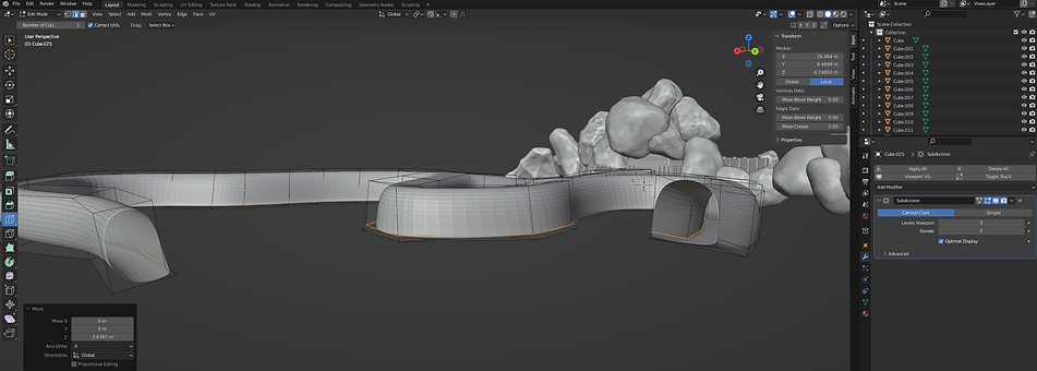
This is my cave system at the moment, with both ends leading too where the main big room will be, I am very happy with how it turned out and am excited to use this method more, maybe for some personal projects too.

I made the big room that the cave tunnels connect too but ran into some problems.

As you can see the mesh is all messy around the sides, this is probably because of the modifiers I used to make the cave room.
I fixed this by using the rock generator and adding lots of rocks around the entrances, this works well because having lots of rocks around a cave entrance doesn't look strange... because its a cave.
I also added some stairs to fix some height problems.

Here is a walk through of the detail I added to the cave tunnels, I used lots of rocks to not only make the cave feel more like a cave but to also make it more claustrophobic so the player has to navigate around and under the rocks. I also added some pipes to the ceiling that the player can follow as a kind of guide to the main room.
Adding Textures To The Cave
I went onto textures.com for some images textures to use and added them to my cave tunnels.
I noticed that the textures has a obvious cut in it where the image ends and the repeat begins, meaning its not seamless. To make it seamless I followed a video that uses box mapping for the UVs.

I used the shader editor for the first time which is a more detailed menu to work with textures. I solved the problem by using a addon the guy recommends from the video.

After sorting out the cave textures I got started on the rock textures.
I went through lots of different textures to find the right one.


After experimenting with other textures I settled on a mix, a mix between the main cave texture and the texture above, this creates variation for the rocks so they don't all look the same.

I added textures to the courtyard using textures from Textures.com, I used the same variation with the rocks like in the cave, but with some mossy ones instead.


I used the same colour palette and materials from my entrance build for the door.
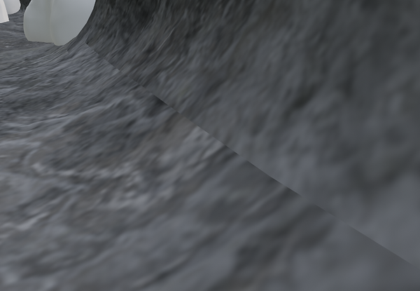
I got my model into unreal and noticed that lots of the meshes were strangely see through, originally I would fix this by using a solidify modifier but after doing some research I discovered it was to do with normals.
Normals help with lighting in game engines, so in my case because while modelling my normals were flipped it gave it that see through one way look. I solved this by going into blender and flipping the normals in edit mode.

As you can see here all of my cave appears to be see through, which is actually a good thing, before fixing the normals the cave looked right from the outside but when you were actually in it, it was all see through, so now it only looks messed up from the outside, which is fine because the player will never see this.

This is what it looks like from the inside.
Early Build - Cave Feedback
After getting my cave working in unreal as a very early build (just the rough layout with some textures) I asked my mum for some feedback on what the environment was like at this stage.
Q - How are the rocks in the cave, placement and visual?
A - "They look good, they are a good size and I like the texture variation, however lots of them feel too smooth, make some more rocks with jagged edges."
Q - What's the cave like itself, to navigate and visual
A - "It feels like its been dug out by a machine which is good however I'd like there to be some variation in terms of navigation, rocks to jump over or climb up so your not just walking all the time"
Q - How do you feel about the various pipes throughout the cave?
A - I like how they are placed, even without detail they weave through the cave well, I like how its something to follow so you don't get lost.
Q - What are your feelings towards the courtyard/starter area?
A - The courtyard feels big enough and the entrance feels grand, I like the gate and the moss variation on the rocks, I would like the ability to climb up some rocks however.
Overall it was very helpful for someone to play test the environment, I got some very interesting feedback in terms of level design and visuals. I feel like the most helpful point she mentioned was how in the cave there was no rocks to climb over, adding this will really make the player have to engage more with the environment.
Roof Support Moodboard

This is a moodboard of some cave roof supports, I want to add some to my tunnels to not only add detail but to hold up all the rocks that are hanging off the ceiling.
I really like the arch way design, I feel like it would work well seeing how my cave is very circular.


Here is a slide show of some of the supports I added, I particularly like the stilt like supports because they can easily bend to hold up any rubble, even though they are all the same asset. It solved me lots of time because of its modularity. I also detailed the pipes running through the caves, adding a little box where they connect up to each other. Overall I'm happy with how the cave details have turned out, its satisfying to see it all come together.
Courtyard Feedback
I was talking with some friends about what work we've all been up too over the Easter break and I was showing them my environment, they both instantly pointed out that they didn't like the texture for the floor in the courtyard, so I went onto textures.com and found a texture that better matches the others. I went with a dark mossy brick texture that works well.

Making the Main Room
I got to work on detailing the main room, adding lots of rocks to the sides to give it detail, while doing this I changed up my original placement of where the mine would be.

As you can see here I made some simple block-out style buildings for a sense of scale and realized that my original map wouldn't work that well in terms of level design. My actual mineshaft entrance was going to be on the left, next to the forge. On paper this works but when I was actually building it all I realized that it would leave the opposite wall very bland and boring.

Having the mineshaft over here allows for a lot more interesting placement of assets, having the minecart rails go around the big rock tower in the centre adds just a little bit more complexity instead of just going to the right a little bit to reach the forge.
Making The Forge
This is my forge building that I've been working on for a couple of days, I built off of the block-out you saw in the Making the Main Room section just above, this made building it easier because I was just adding detail to the pre existing shapes. I went with a very similar design on either side because they both serve a similar purpose, on the left, minerals will be transported into the forge via mine carts, they will be processed then transported out the exit on the right side to go into the storage building.
The biggest decision I had to make with this building was would I have an interior or not, up until recently I planned on not having one, but when I got to making the building I realized that if I didn't have a interior, not only would the building be way less interesting to explore for the player, but also I would finish it very quickly, just making the exterior. I decided to have a interior because not only would it add an extra layer of depth to the build for the player to explore, it would also challenge me in terms of modelling, I have made lots of buildings but hardly any accessible interiors.

Switching to having a accessible interior meant that I had to change a lot, here to can see a side on view of the forge, as you can see the back is really messy, this is because the original size of the building was way too small for a player to explore, let alone have big machinery. Luckily all this mess is hidden by the cave wall, so the player will not see it.

When making the interior I included lots of pipes, for the main section where the forge bit will be, I went with a different design for the main chimney, I feel like the design works very well because it looks different to any other pipe, making it look more important.

I showed my step-dad the building and design of the interior and he said that it would be cool if there was a kind of trough with molten metal flowing, with little bits in it.
I liked the idea because it would be an easy way of adding some simple animation to the interior.
I made a mock up of the trough to demonstrate my idea, using some simple animation in blender to make it look like the liquid is moving.
Below is a short animation showing this.
Lighting and Skyrim's Dwemer Caves
When showing Frazer my cave system, he asked how I was going to include lights, and recommended researching Dwemer style caves from Skyrim (2011)

I really like the style they have, the lanterns on pillars is a really good idea that I could use, instead of having lanterns on just pillars, I could have them hanging under pipes.
I also really like the gears turning in the walls, this is a small piece of detail I can add to the caves to make them feel less empty. It also fits in well with the steampunk aesthetic.
I made a lantern design with the style of the dwemer architecture. This one asset can have lots of variation in terms of position, hanging from a support with a beam, hanging off a pipe or leaning against a rock.
You can see these variations below.


Main Cave Layout - Forge Position
I modelled my forge outside of my cave, this gave me the room to look around the model freely, but it also means that adding it back to the cave would be a challenge, getting the sizing right and getting a massive forge to fit into this surprisingly small cave.
When adding it back to the environment, I had to move the cave around to make it fit, being careful to not obscure parts of the roof and the chimney. I realized that the floor was very uneven in the main room, this wasn't good for the building because some of the ground was clipping through the floor of the forge.
I fixed this by lifting the model up and covering the hovering look with rocks, this makes the model look like its been placed here and is surrounded by the cave. It makes it feel more messy and random, just like an actual cave.
When showing some friends the forge with all its textures, they said that it would look better if it was more dirty, seeing how it is in a cave.
So I changed the texture to the one that the courtyard walls use and it came out pretty good, I feel like it works a lot better now.

Mineshaft & Rails

When making the mineshaft I had lots of different ideas on how I wanted it to look, I tried out this scaffolding design at first but it didn't really work that well. So I went with the supports I used for the cave.

I used lots of pervious assets like the mine supports and the pipes, this will be a entrance for a mineshaft, with a rail connecting up to the forge.
When making the rail I originally tried to use the array modifier but because the tracks weren't even it was hard for them to line up.

I used a plane along the tracks then used loop cuts to make the tracks


Storage Room
If you look back at my early concepts for the main room of the cave you will see all the block-out buildings.
Since making the other buildings, changing the layout of the cave and spending more time with the main room I realized that there isn't enough room for a proper storage building like in my original design.

I modified my original idea to make the storage building into a separate room, this gives me the space to have lots of things and makes the main room less cramped.

My original idea was to have a very messy storage room with boxes stacked at both sides with a pathway down the middle to an elevator. Although I like this idea I felt like it didn't go with the rest of the buildings, everything is very organized and I feel like the storage room needs to reflect that.

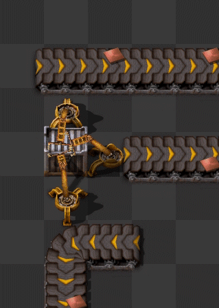
Example of robot arms from Factorio
This is a simple robot on wheels I made for the tracks on the platform, it has a simple grabber arm that can be used to transport minerals from minecart to container.
I made the right side of the cave a lot smaller and dedicated that area for roof supports, the left side was be similar to a train/railway unloading platform. I made some tracks going down the centre and some smaller tracks on the platform itself.
The reason the platform has tracks is because I wanted a kind of robotic arm to move the minerals from the minecarts into storage. The main inspiration for this was Factorio (2016) in the game there are robotic arms you can make to transport almost any item from one thing to another. For example transporting iron ore from a conveyer belt to a furnace.


I made some storage containers to store the minerals, I made three variations, a simple box, a rectangular container and a big cylindrical container with emissive lighting. All of these have a variation where the top is open for minerals to go in, these can be found by the rail waiting for use. I also made some minecarts for the rails, these are not only in the storage room but by the mineshaft and in the forge.

I also made an elevator at the end of the platform, this would be used to transport cargo to the surface. Before making it I looked at some real world examples of industrial style elevators.


I noticed that a lot of the elevators had a bit of the wall sticking out about half way up the inside, like in the bottom 2 images on the left. I made sure to include this in my design.
I also added some of the storage containers to the elevator to make it look like its in use.
I also added a sign above the entrance to the storage room, I chose to not add English text and get rid of the English text o the mineshaft to keep it all consistently Japanese.
I translated it to Japanese using Google Translate.

Bar/Canteen
The bar features some seats, tables and a bar to get drinks/food, to the left of the bar there is a storage building where all the food and drink are stored.


I kept the bar quite simple, not spending that much time on it because of the deadline closing in. I still think it looks good but some areas could be improved, especially the chairs, although they do their job looking like chairs they look a bit basic.
Getting my Environment into UE4
After grouping all my objects into one and exporting it into unreal I noticed that some of the collision was off, as you can see in the image below, the purple lines show collision and the floor doesn't have it.

To solve this I started to experiment with the materials, theirs an option in the material property's that make them two sides, which solves the issue of normals, this is a problem I had previously when putting the cave itself into unreal. After turning off this setting I realized that normals not only matter with lighting and visuals, but collision. To fix this issue with the floor I flipped the normals in blender then exported them back into unreal. Solving the collision issue.
I had the same issue with the storage room cave, because I made it so long after putting my earlier version of the cave into unreal I forgot that the normals wouldn't work, so when I tried to walk on the cave floor I fell straight through.

All the blue lines are the normals, before fixing them the lines on the highlighted floor, they were facing down.
I also realized that the texture was effected by the normals, creating this line across the right side of the cave.
To fix this visual issue I added rocks along the right side, hiding this texture error.


I'm actually happy that this issue came up because I like the look of the rocks behind the pillars a lot more than the look before.
I added steam to the forge, with some lights behind it to illuminate the steam, making the forge feel hotter.

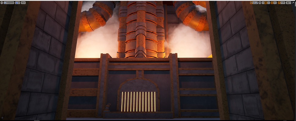


I really like how it all turned out, especially the smoke at the top of big chimney, because of the angle that the player sees it from, it looks darker than usual, like its dirty.
At first when I built it, it was all black but luckily I had already encountered this issue, so I was able to look back at my website and follow it like a tutorial.
I thought I'd fixed my lighting issues, so I went onto adding lights to the environment, adding point lights to all the lamps. When I built the lighting again, I got a new problem, lost of the faces started bugging out, breaking the lighting and creating more problems.


After trying to fix these issue for most of the afternoon, I went with Frazer to do a website review, this time focusing on the practical work I've done, we discussed the issues I had with lighting, and how because an exe isn't part of the brief, I could get away with not building the lighting and playing the game in the editor. This would allow me to focus on the more important aspects and get people play testing it sooner. I did some research and found that you can remove the preview watermark on the lights that appear before its all been built. This makes the idea of not building the lighting a good possibility.
Getting Working Doors
One of the few mechanics my game is going to have is some working doors, one at the entrance to the cave and a elevator door in the storage area, to make this I researched how to make a sliding door and found a very helpful tutorial.
Although this tutorial worked well, I wanted my door to slide up instead of to the right, to change this I made different keyframes on the Z axis instead of the Y.

Here you can see the blueprint system I used and the timeline below.

Adding Trees To The Exterior
A while ago I spoke with Frazer about how I wanted to add trees, but I didn't know how to add them because modelling a low poly tree then adding textures would look strange, he brought up the point that because trees are such a complex asset themselves that using someone else's asset would be fine.
So I went onto the unreal marketplace in search for some good trees that are free.
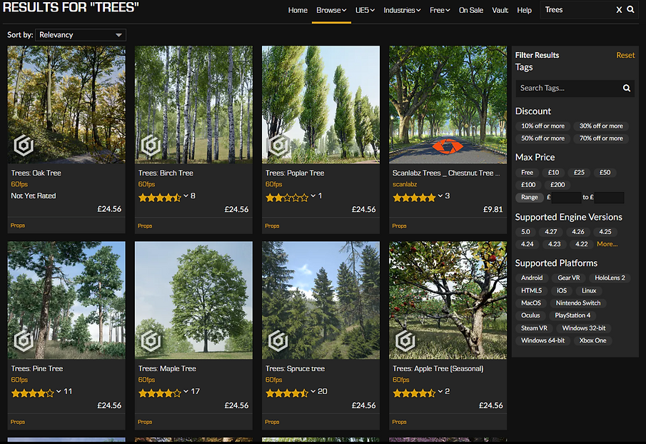
After looking around for a while I came across a pack that includes lots of tree variation and all the tools someone would need to make a forest. The best thing about it is that its free.

I experimented with different trees in the pack, I tried this one first and realized that it looked very dark for some reason, probably something to do with not building the lighting.
Next I tried this pine tree that worked really well, I really like the look of it and it fits the rest of the environment well.


I placed some others around the mountain and outside the courtyard wall to add some life to the rest of the exterior.

I'm very happy with how these assets turned out, they work very well with my environment, complimenting the rocks well.
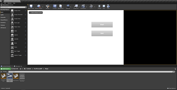
Making a Main Menu
To make a main menu I looked up some tutorials to follow, because I'm still very new to blueprints and I've never made a main menu in UE4 before.

I followed this video to make my menu, following it went quite smoothly apart from a couple problems I will talk about below.
My first problem was that the image for the background image which is the white bit of the menu, didn't cover the whole screen, I realized that it was because of the size of my monitor. My monitor at home is a ultrawide, which means that the aspect ratio is 21:9, instead of the regular 16:9.
To fix the aspect ratio problem I had to mimic the size of a 16:9 monitor with the unreal editor window.

On the right is my desktop, which is the extra space I get from my ultrawide.
My last problem was that after I would press Start, I couldn't move my character, after experimenting with blueprints for a bit I fixed it by going into the level blueprint for my environment and adding a "Set Input Mode Game Only" node and connecting a player controller to it.

After fixing all the technical issues I went back to the menu to change the font, I used a default unreal font for the menu and although it doesn't look terrible, it looks quite basic. To fix this I added a font I found on dafont and added an outline to all the text.

I like the look of this a lot more than the original, at first I was debating whether to change the font at all because it works as intended. But I am happy I switched it, it adds some nice flair to the title screen. I especially like the buttons with their black outline. It really makes the text pop.
Adding Sound Ambience and Sound Effects
This is my first time adding sound effects to unreal but I've added some to my animations in the past using a piece of software called Soundly. Soundly is a free audio library with tons of sounds, there's a premium version with even more sounds but the free one still has lots of uses.
I sourced most of my sound effects from there, like the meadow ambience for the outside, the cave ambience for the... cave (wow surprising) and lots of the pipe noises.

This is what Soundly looks like, here you can see me getting a piece of ambience and highlighting the track to download.

I added the sound effects to unreal, made then a "Cue" then was able to open them up in this sound cue menu. Here I changed lots of settings, I made it look, changed where the sound would play and the falloff variation.

The box around the courtyard is where the sound effect will play, for this example it plays the meadows ambience.

For the forge I made it a circle with a big falloff range, (the falloff range being the big sphere) this means that the closer the player gets to the forge the louder the ambience will be. To get the sound effect I didn't use soundly, I looked around on it but couldn't find any suitable ambience. So I tried YouTube, searching for steampunk forge/industrial noises.
To test the ambience I played it through YouTube and walked around my forge and the ambience worked very well. It really set the mood for the forge, just standing in the forge with the ambience really makes it more immersive.
I also wanted a sound effect for the mine entrance door opening, so I looked up some steampunk mechanical sound effects and found some that worked really well.
Primary Research - Focus Group - Finished Product
After adding all the sound effects I wanted to add, my game was finished, I wanted to get some people to play it, to give their thoughts on the experience, but before that I made a survey to log down their opinions.
You can view my survey HERE, its only 7 questions long, it asks the player about numerous parts of the game, from gameplay and lighting to scale of the environment and audio.
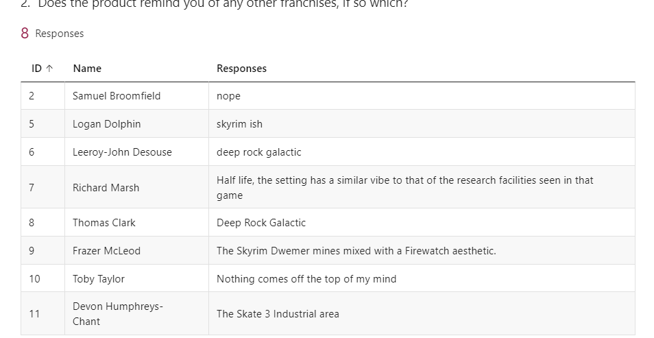
After letting people play my game and give there opinions I'm left with 8 responses, from my classmates and some lectures, I got some very helpful feedback of my game.
Below you can see the questions with all the feedback.


I am very happy with all the feedback from question 3, the most surprising thing is that everyone seemed to like the gameplay and textures, I was worried that the gameplay would be too basic because I don't have many mechanics, and I was worried people would notice little problems with the textures, (like some of the rocks not being smooth, where you can clearly see their faces) but I guess it was just a case that when you create something you always see all the little imperfections that the audience probably won't notice. I am very happy people liked the sense of scale of the environment because that's something I felt I did quite well and its good to see that people share my opinion.

Though the play testing, watching people play I found lots of new bugs that I hadn't seen before, all of them were tied to collision, which is related to the normals of faces. I found that the sides of the forge were the most common so after only a couple people played I fixed it by adding a scaled up cube behind the wall, so the player couldn't glitch out.


I am obviously very happy with the results here, most of them being 5/5, but I am the most happy about the 4's, both being from people who are a lot better at modelling and game development than me, the fact that they still gave it a 4 makes me very happy with how far I've come in terms of modelling and games development.


I like the how varied the constructive criticism is, from simple suggestions like adding a working elevator to adding additional audio to the games mechanics, and experimenting with light more. I will keep these points in mind when I start future projects so that I can learn from the previous criticism and make a better product next time around.
Overall I am very happy with the survey and what people thought of my game, it was very interesting to see people play through it, to see where they go first and where they would try and break it.
Below you can see a walkthrough of my game.


